plot(mtcars$mpg)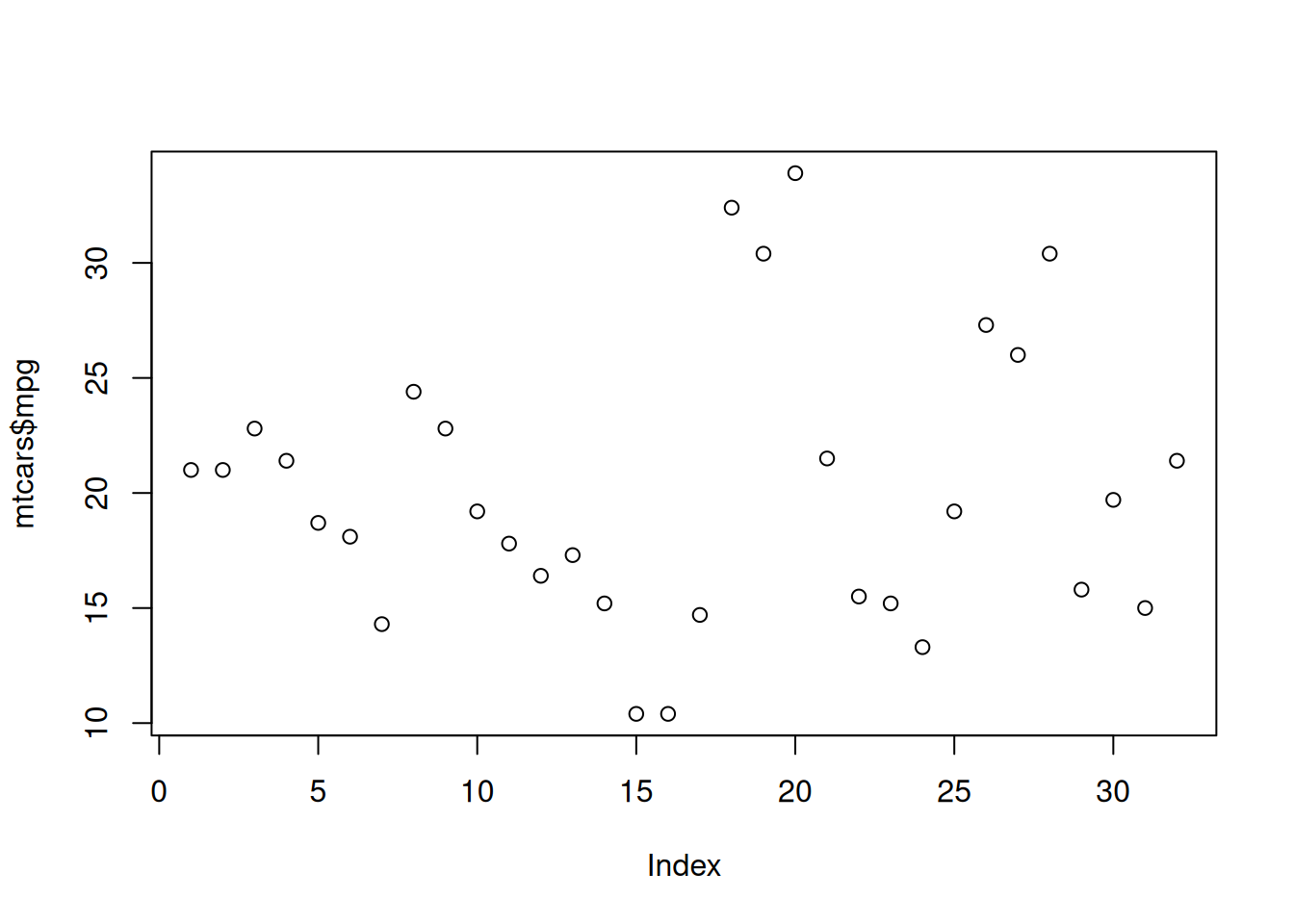
Modifiend from Statistical Computing
This tutorial provides an introduction on how to create different graphics in R. For this tutorial, we will focus on plotting different components from the mtcars data set.
Basic
Grouping
Tweaking
Here we will use the built-in R functions to create different graphics. The main function that you will use is the plot(). It contains much of the functionality to create many different plots in R. Additionally, it works well for different classes of R objects. It will provide many important plots that you will need for a certain statistical analysis.
Let’s first create a scatter plot for one variable using the mpg variable. This is done using the plot() and setting the first argument x to the vector.
plot(mtcars$mpg)
Notice that the x-axis is the index (which is not informative) and the y-axis is the mpg values.
Let’s connect the points with a line. This is done by setting the type argument to "l".
plot(mtcars$mpg, type = "l")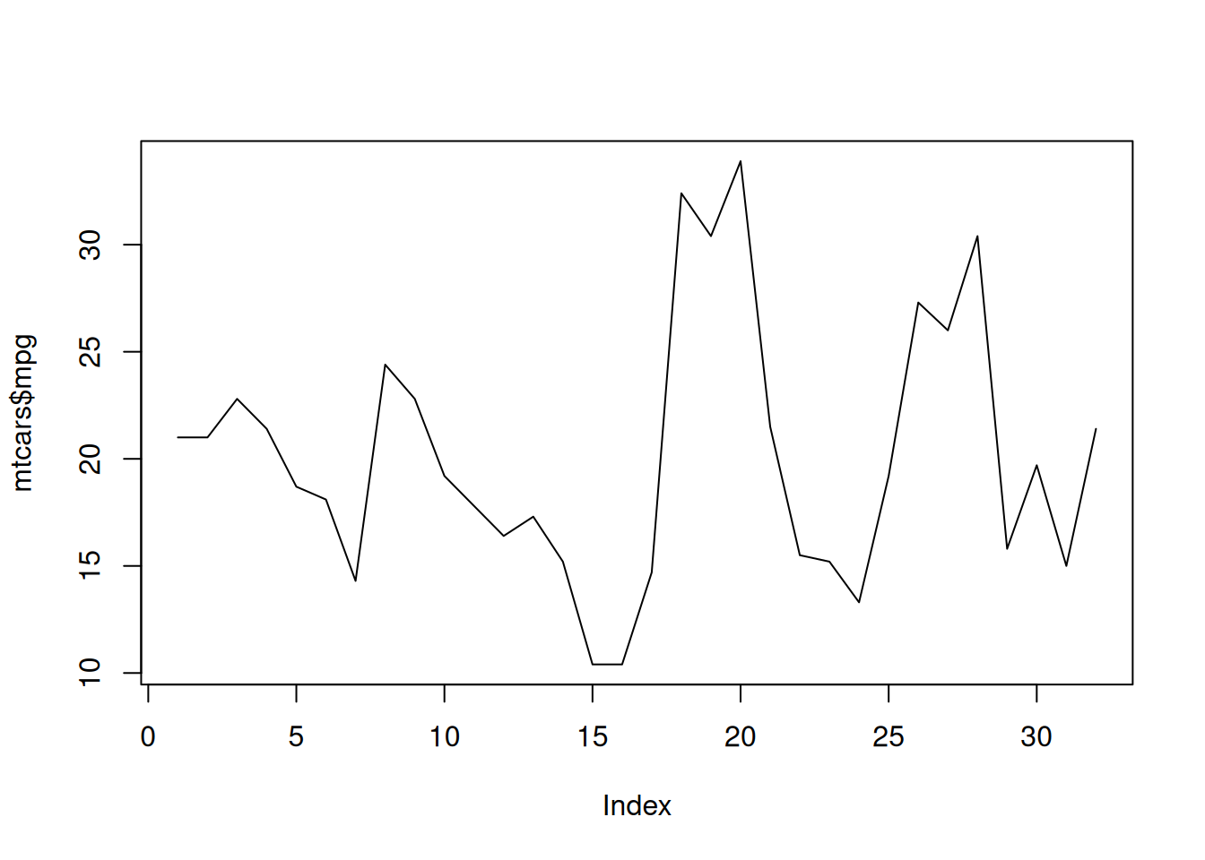
Let’s add the points back to the plot and keep the lines. What we are going to do is first create the scatter plot as we did before, but we will also use the lines() function to add the lines. The lines() function needs the x argument which is a vector of points (mpg). The two lines of code must run together.
plot(mtcars$mpg)
lines(mtcars$mpg)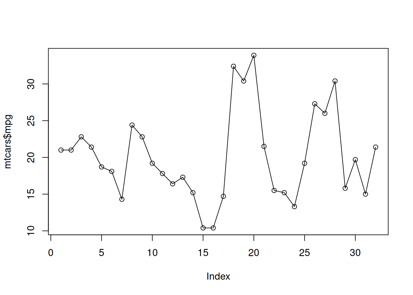
Now, let’s create a more realistic scatter plot with 2 variables. This is done by specifying the y argument with another variable in addition to the x argument in the plot() funciton . Plot a scatter plot between mpg and disp.
plot(mtcars$mpg,mtcars$disp)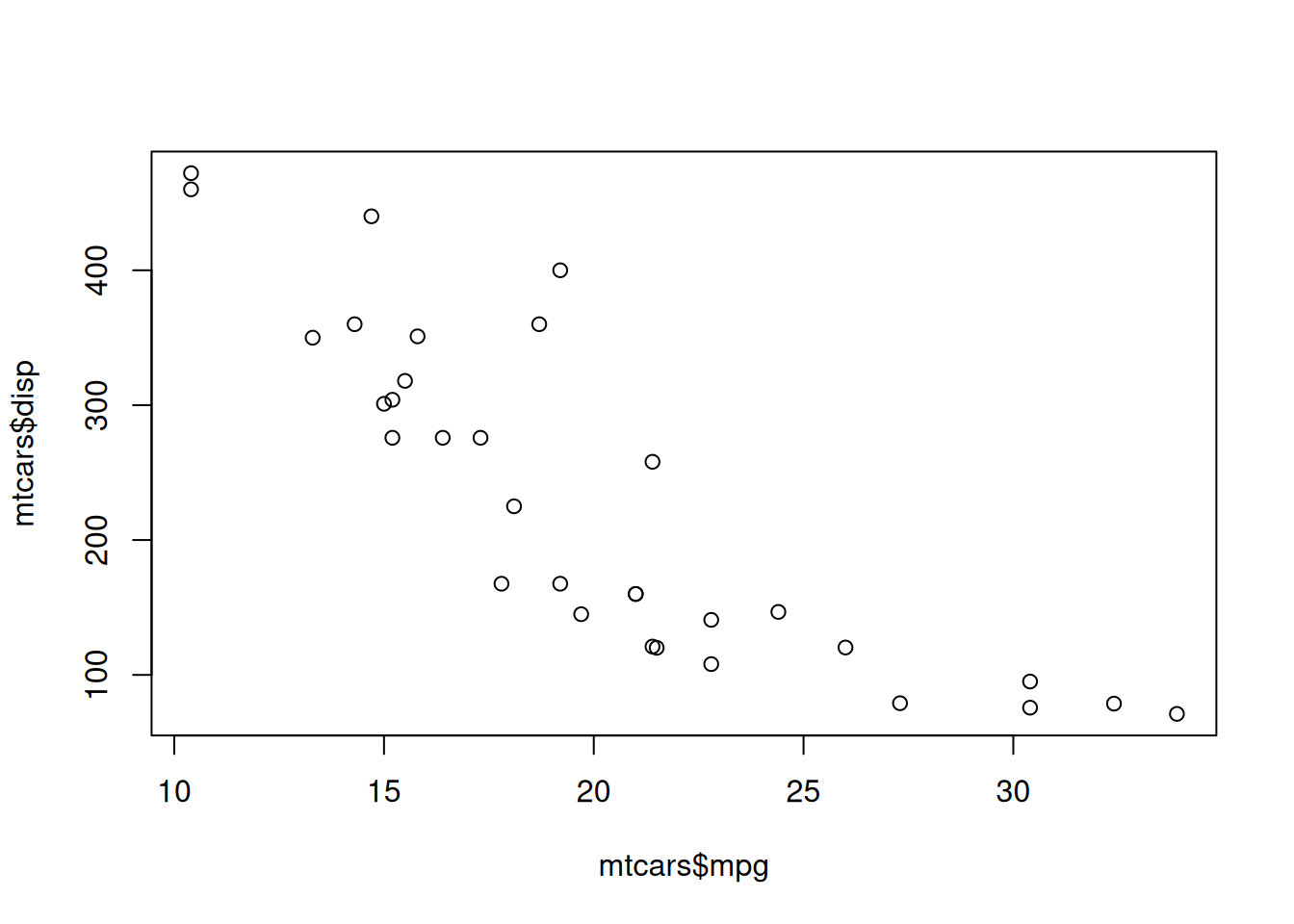
Now, let’s change the the axis labels and plot title. This is done by using the arguments main, xlab, and ylab. The main argument changes the title of the plot.
To create a histogram, use the hist() function. The hist() function only needs x argument which is numerical vector. Create a histogram with the mpg variable.
hist(mtcars$mpg)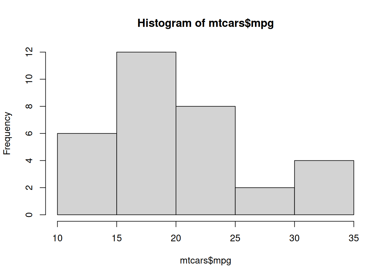
If you want to change the number of breaks in the histogram, use the breaks argument. Create a new histogram of the mpg variable with ten breaks.
hist(mtcars$mpg, breaks = 10)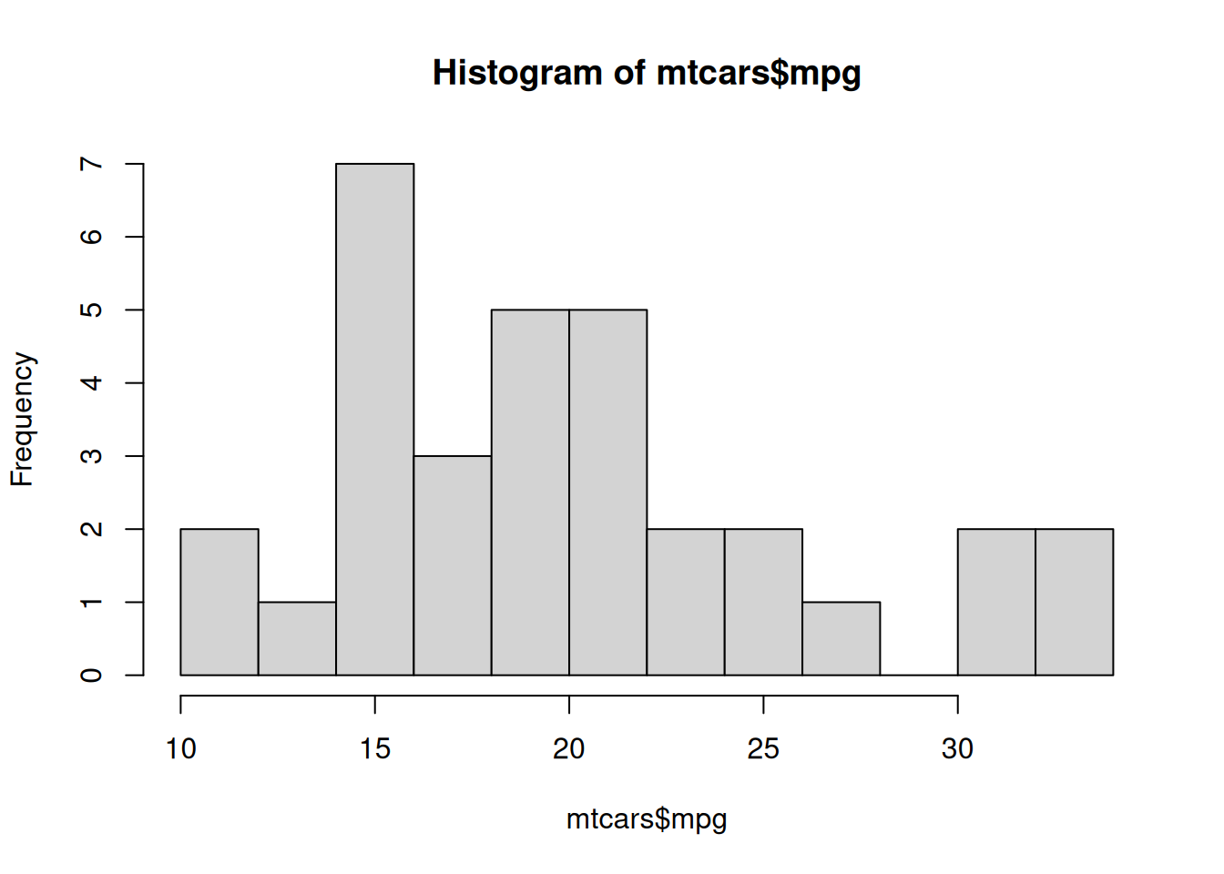
The above histograms provide frequencies instead of relative frequencies. If you want relative frequencies, use the freq argument and set it equal to FALSE in hist().
hist(mtcars$mpg, freq = FALSE)
A density plot can be used instead of a histogram. This is done by using the density() function to create an object containing the information to create density function. Then, use the plot() function to display the plot. The only argument the density() function needs is x which is the data to be used. Create a density plot the mpg variable.
plot(density(mtcars$mpg))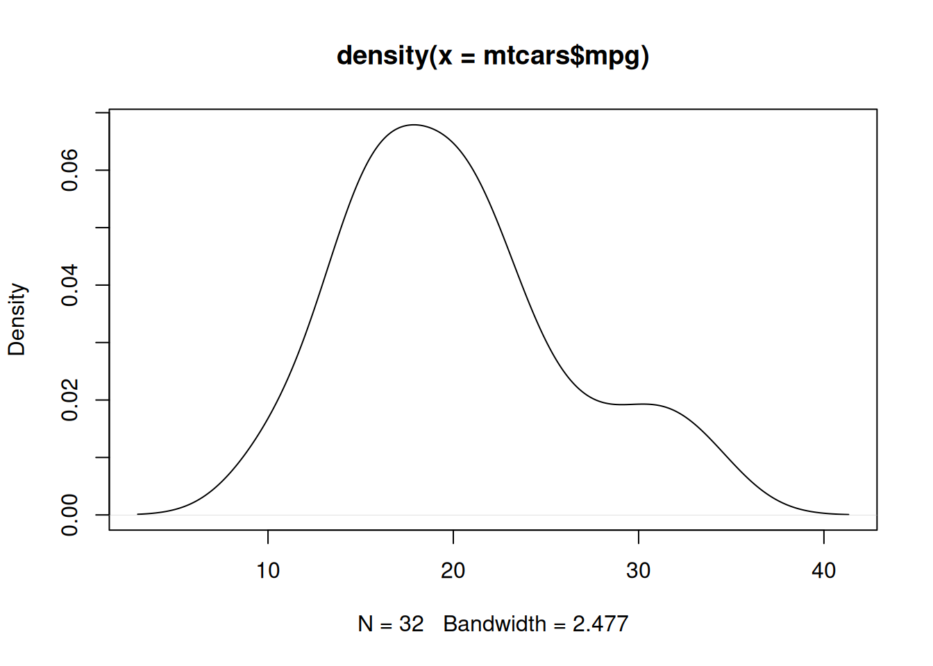
Now, if we want to overlay the density function over a histogram, use the lines() function with the output from the density() function as its main input. First create the histogram using the hist() function and setting the freq argument to FALSE. Then use the lines() function to overlay the density. Make sure to run both lines together.
hist(mtcars$mpg, freq = FALSE)
lines(density(mtcars$mpg))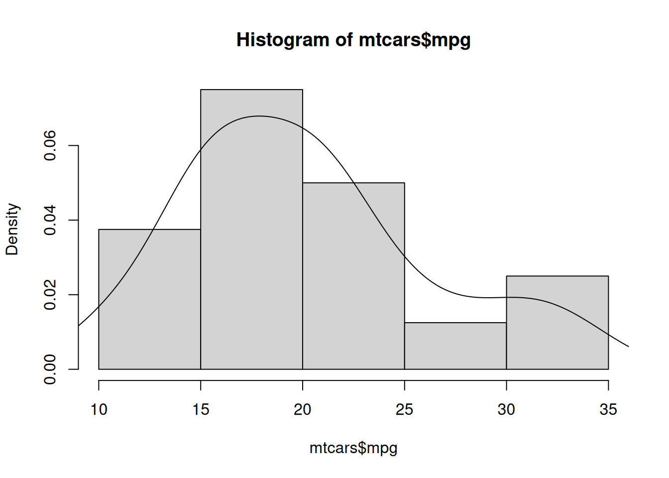
A commonly used plot to display relevant statistics is the box plot. To create a box plot use the boxplot() argument. The function only needs the x argument which specifies the data to create the box plot. Use the box plot function to create a box plot on for the variable mpg.
boxplot(mtcars$mpg)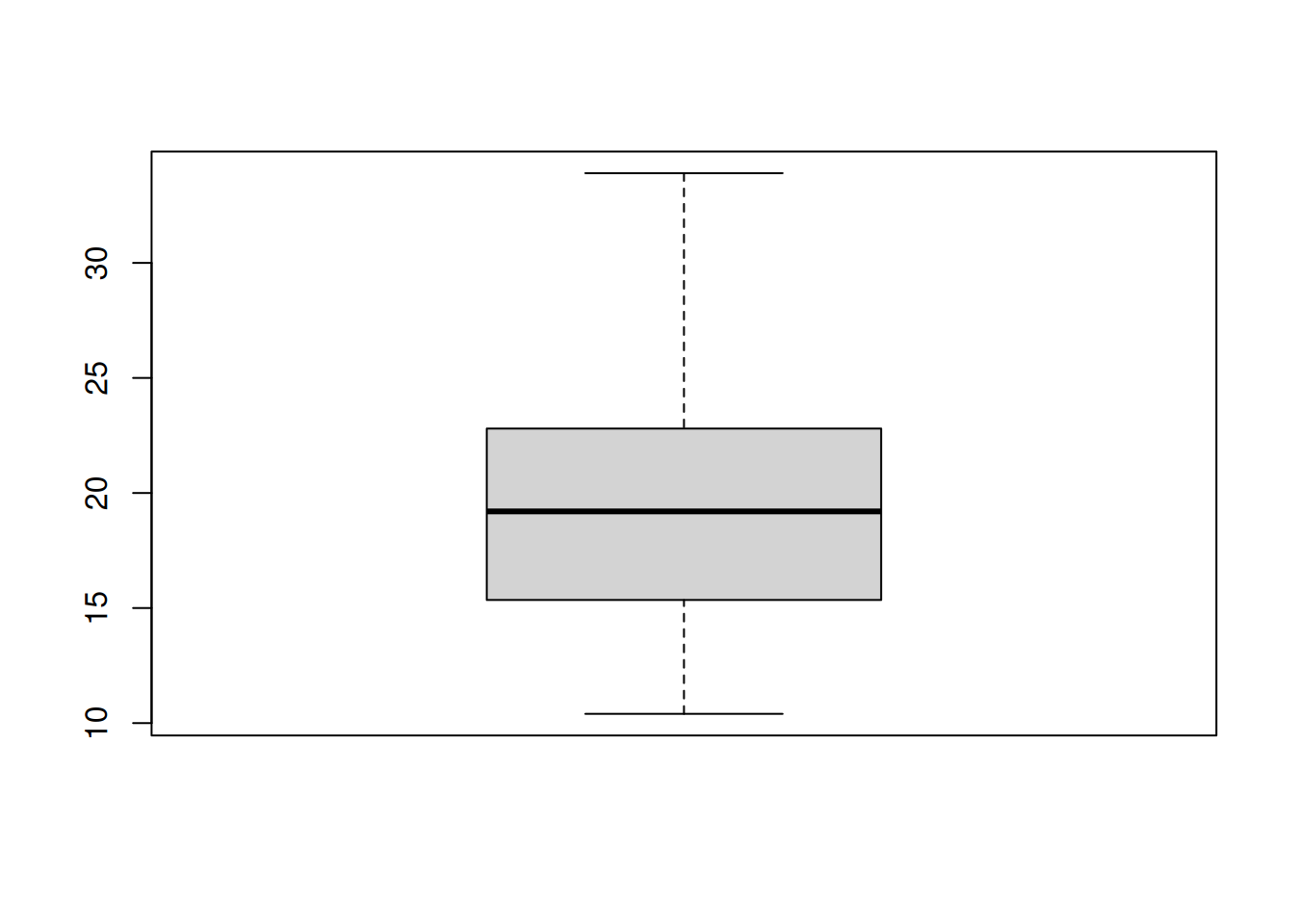
If you want to make the box plot horizontal, use horizontal and set it equal to TRUE.
boxplot(mtcars$mpg, horizontal = TRUE)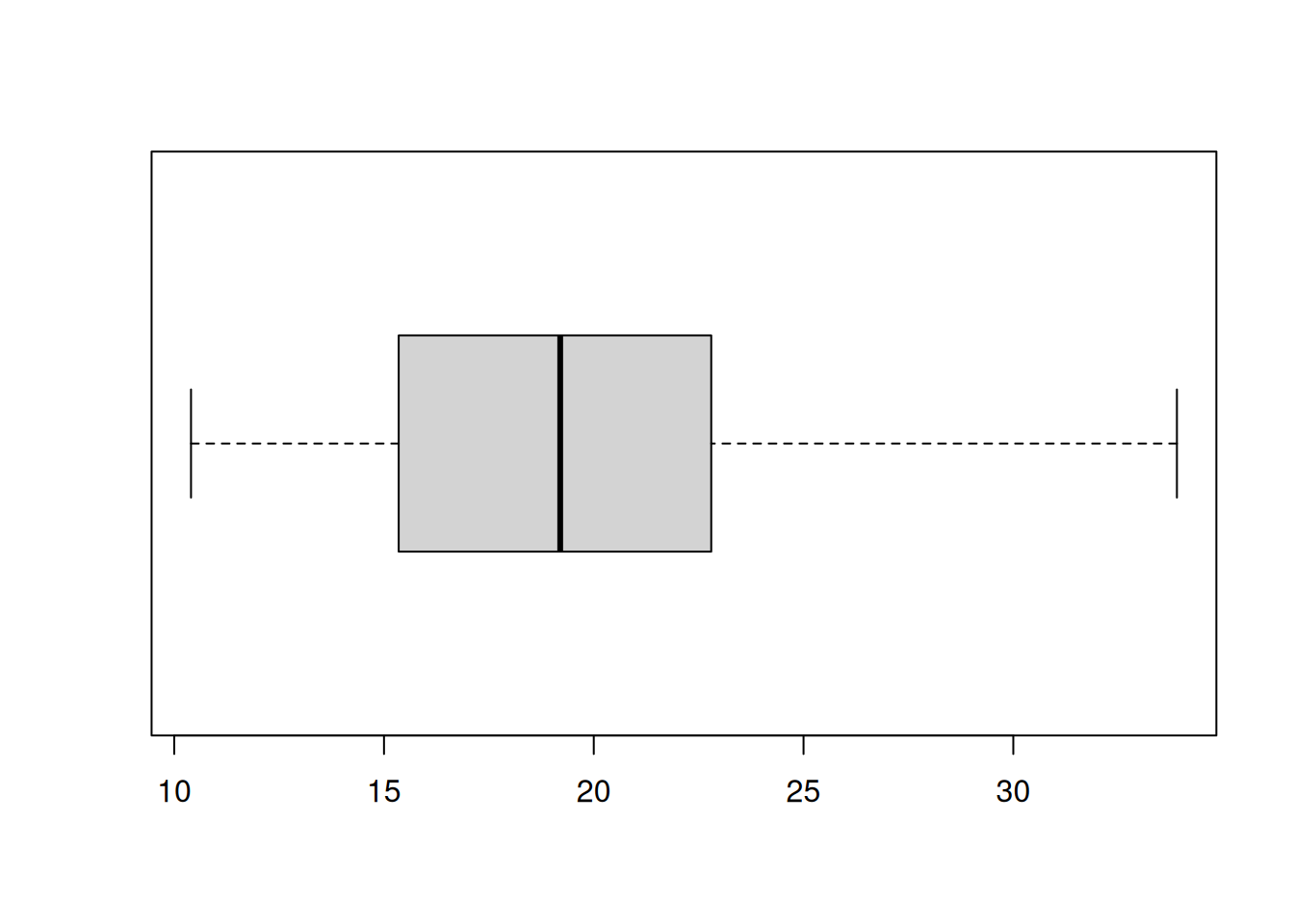
A histogram shows you the frequency for a continuous variable. A bar chart will show you the frequency of a categorical or discrete variable. To create a bar chart, use the barplot() function. The main argument it needs is the height argument which needs to be an object from the table() function. Create a bar chart for the cyl variable.
barplot(table(mtcars$cyl))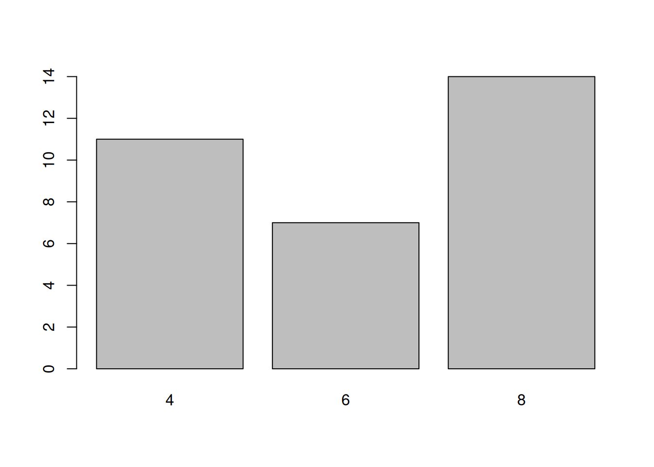
While I do not recommend using a pie chart, R is capable of creating one using the pie() function. It only needs the x argument which is a vector numerical quantities. This could be the output from the table() function. Create a pie chart with the cyl variable.
pie(table(mtcars$cyl))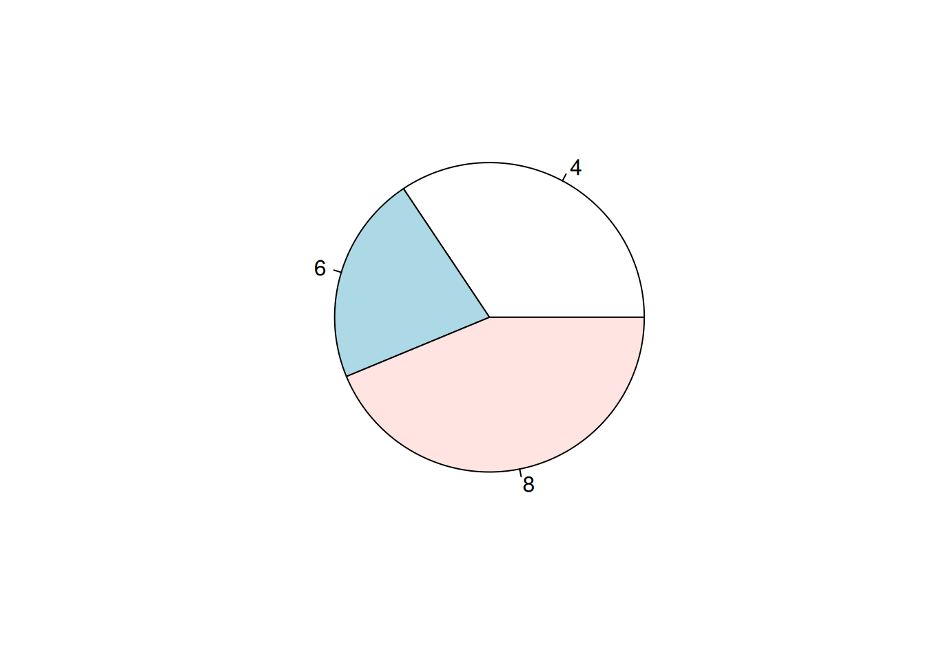
Similar to obtaining statistics for certain groups, plots can be grouped to reveal certain trends. We will look at a couple of methods to visualize different groups.
Two ways to display groups is by using color coding or panels. I will show you what I think is the best way to group variables. There may be better ways to do this, such as using the ggplot2 package. Before we begin, create three new R objects that are a subset of the mtcars data set into 3 different data sets with for the three different values of the cyl variable: “4”, “6”, and “8”. use the subset() function to create the different data sets. Name the new R objects mtcars_4, mtcars_6, and mtcars_8, respectively.
mtcars_4 <- subset(mtcars, cyl == 4)
mtcars_6 <- subset(mtcars, cyl == 6)
mtcars_8 <- subset(mtcars, cyl == 8)To create different colors points for their respective label associated cyl variable. First create a base scatter plot using the plot() function to set up the plot. Then one by one, overlay a set of new points on the base plot using the points() function. The first two arguments should be the vectors of data from their respective R object subset. Also, use the col argument to change the color of the points. The col argument takes either a string or a number.
plot(mtcars$mpg, mtcars$disp)
points(mtcars_4$mpg, mtcars_4$disp, col = "red")
points(mtcars_6$mpg, mtcars_6$disp, col = "blue")
points(mtcars_8$mpg, mtcars_8$disp, col = "green")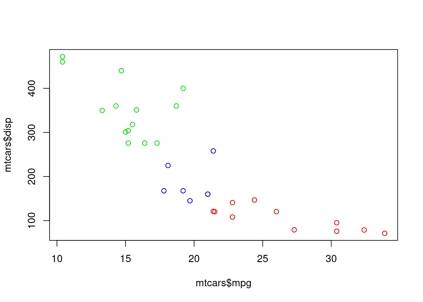
Now, it us more difficult to overlay histograms on a plot to different colors. Therefore, a panel approach may be more beneficial. This can be done by setting up R to plot a grid of plots. To do this, use the par() to tell R how to set up the grid. Then use the mfrow argument, which is a vector of length two, to set up a grid. The mfrow argument usually has an input of c(ROWS,COLS) which states the number of rows and the number of columns. Once this is done, the next plots you create will be used to populate the grid.
par(mfrow=c(1,3))
hist(mtcars_4$mpg)
hist(mtcars_6$mpg)
hist(mtcars_8$mpg)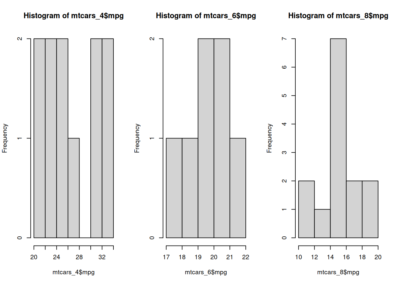
Every time you use the par() function, it will change how graphics are created in an R session. Therefore, all your plots will follow the new graphic parameters. You will need to reset it by typing dev.off().
To visualize two categorical variables, we can use a color-coded bar chart to compare the frequencies of the categories. This is simple to do with the barplot() function. First, use the table() function to create a cross-tabulation of the frequencies for two variables. Then use the boxplot() function to visualize both variables. Then use legend argument to create a label when the bar chart is color-coded. Additionally, use the beside argument to change how the plot looks. Use the code below to compare the variables cyl and am variable.
barplot(table(mtcars$cyl, mtcars$am), beside = TRUE, legend = rownames(table(mtcars$cyl, mtcars$am)))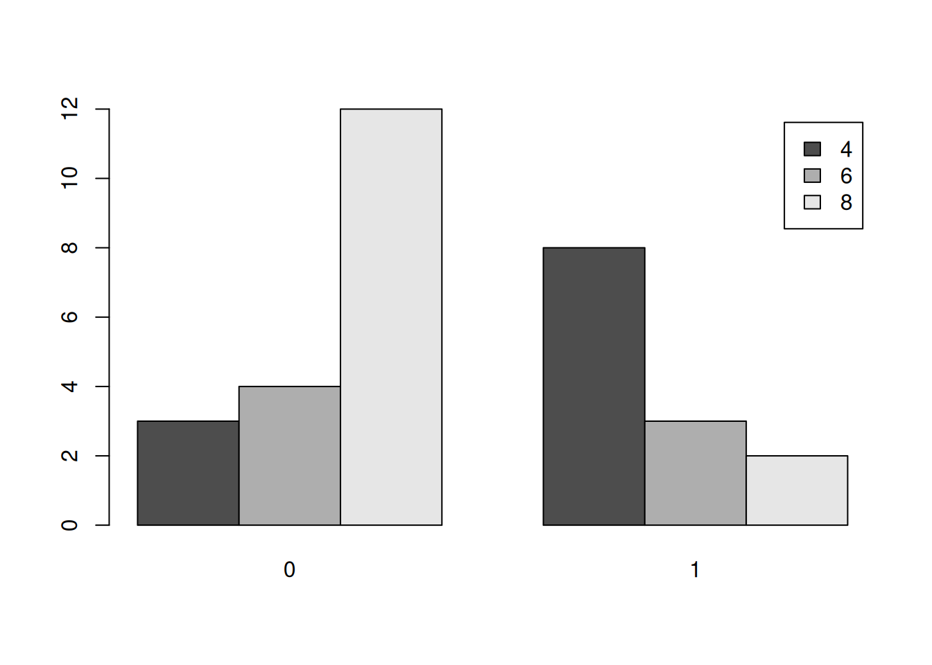
Notice that I use the rownames() function to label the legend.
The main tweaking of plots I will talk about is changing the the axis label and titles. For the most part, each function allows you to use the main, xlab, and ylab arguments. The main allows you to change the title. The xlab and ylab arguments allow you to change the labels for the x-axis and y-axis, respectively. Create a scatter plot for the variables mpg and disp and change the labels.
plot(mtcars$mpg, mtcars$disp, main = "MPG vs Displacement", xlab = "MPG", ylab = "Displacement")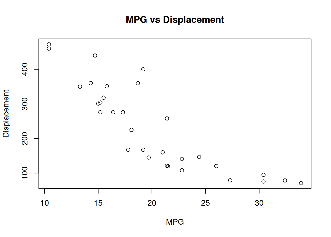
The ggplot2 package provides a set of functions to create different graphics. For more information on plotting in ggplot2, please visit the this excellent resource. Here we will discuss some of the basics to the ggplot2. From my perspective, ggplot2 creates a plot by adding layers to a base plot. The syntax is designed for you to change different components of a plot in an intuitive manner. For this tutorial, we will focus on plotting different components from the mpg data set.
Basic
Grouping
Themes/Tweaking
To begin, the ggplot2 package really works well when you are using data frames. If you have any output that you want to plot, convert into to a data frame. Once we have our data set, the first thing you would want to do is specify the main components of your base plot. This will be what will be plotted on your x-axis, and what will be plotted on your y-axis. Next, you will create the the type of plot. Lastly, you will add different layers to tweak the plot for your needs. This can be changing the layout or even overlaying another plot. The ggplot2 package provides you with tools to do almost everything you need to create a plot easily.
Before we begin plotting, load ggplot2 in R.
library(ggplot2)Now, when we create a base plot, we will use the ggplot() function. This will initialize the data that we need to use with the data argument and how to map it on the x and y axis with the mapping argument. The mapping argument uses the aes() function which constructs the mapping mechanism for the base plot. The aes() function requires the x argument and optionally uses the y argument to set which values represents the x and y axis. The aes() function also accepts other arguments for grouping or other aesthetics.
Before we begin, create a new variable in mtcars called ind and place a numeric vector which contains integers from 1 to 32.
mtcars$ind <- c(1:32)Now, let’s create the base plot and assign it to gg_1. Use the ggplot() function and set mtcars as its data and set x to ind and y = mpg.
gg_1 <- ggplot(mtcars, aes(ind, mpg))This base plot is now used to create certain plots. Plots are created by adding functions to the base plot. This is done by using the + operator and then a specific ggplot2 function. Below we will go over some of the functions necessary.
To create a scatter plot in ggplot2, add the geom_point() function to the base plot. You do not need to specify any arguments in the function. Create a scatter plot to gg_1
gg_1 + geom_point()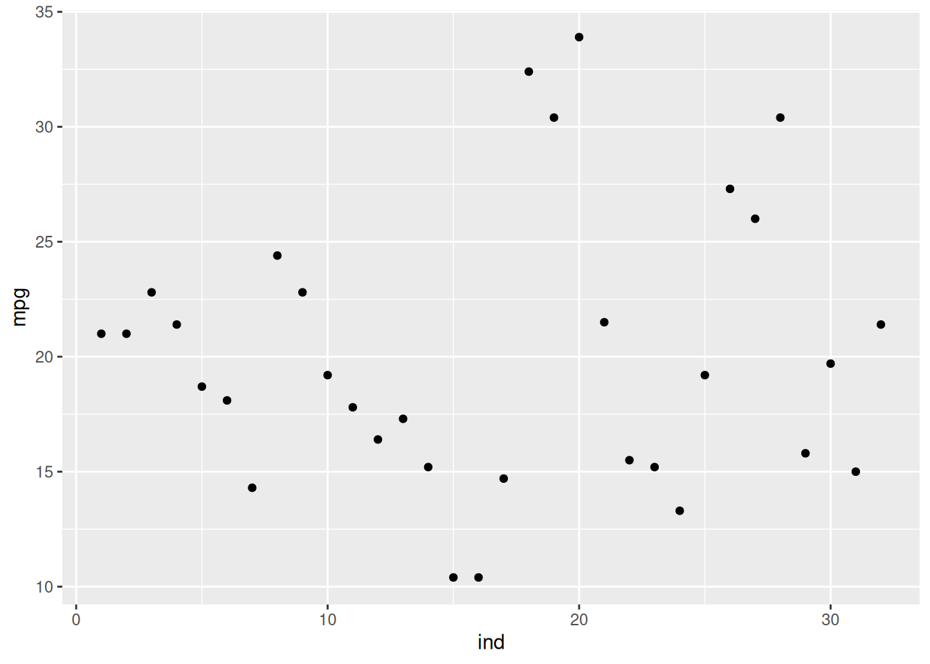
If we want to put lines instead of points, we will need to use the geom_point() function. Change the points to a line.
gg_1 + geom_line()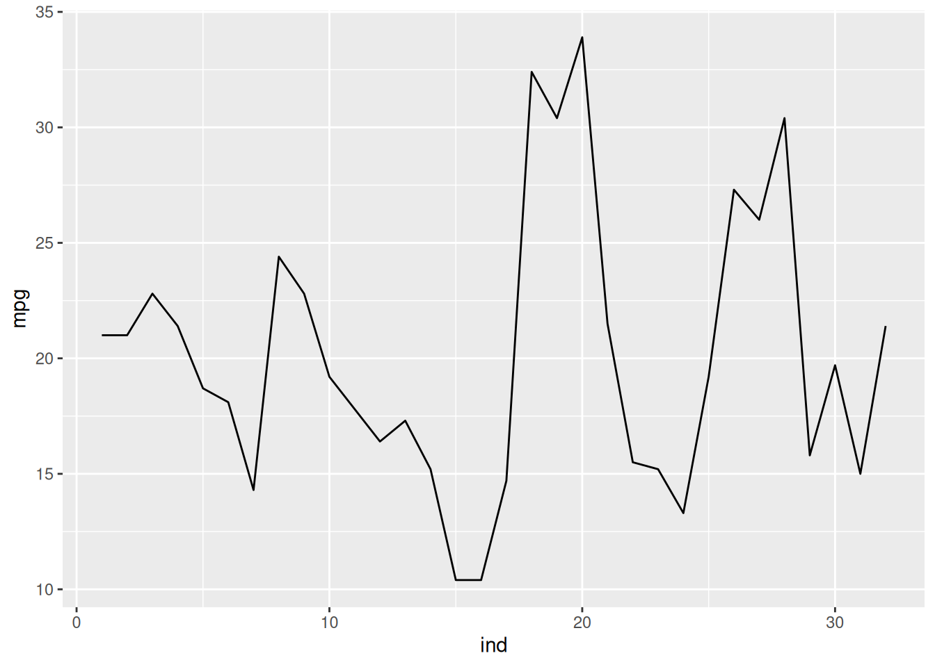
To overlay points to the plot, add geom_point() as well as geom_line(). Add points to the plot above.
gg_1 + geom_point() + geom_line()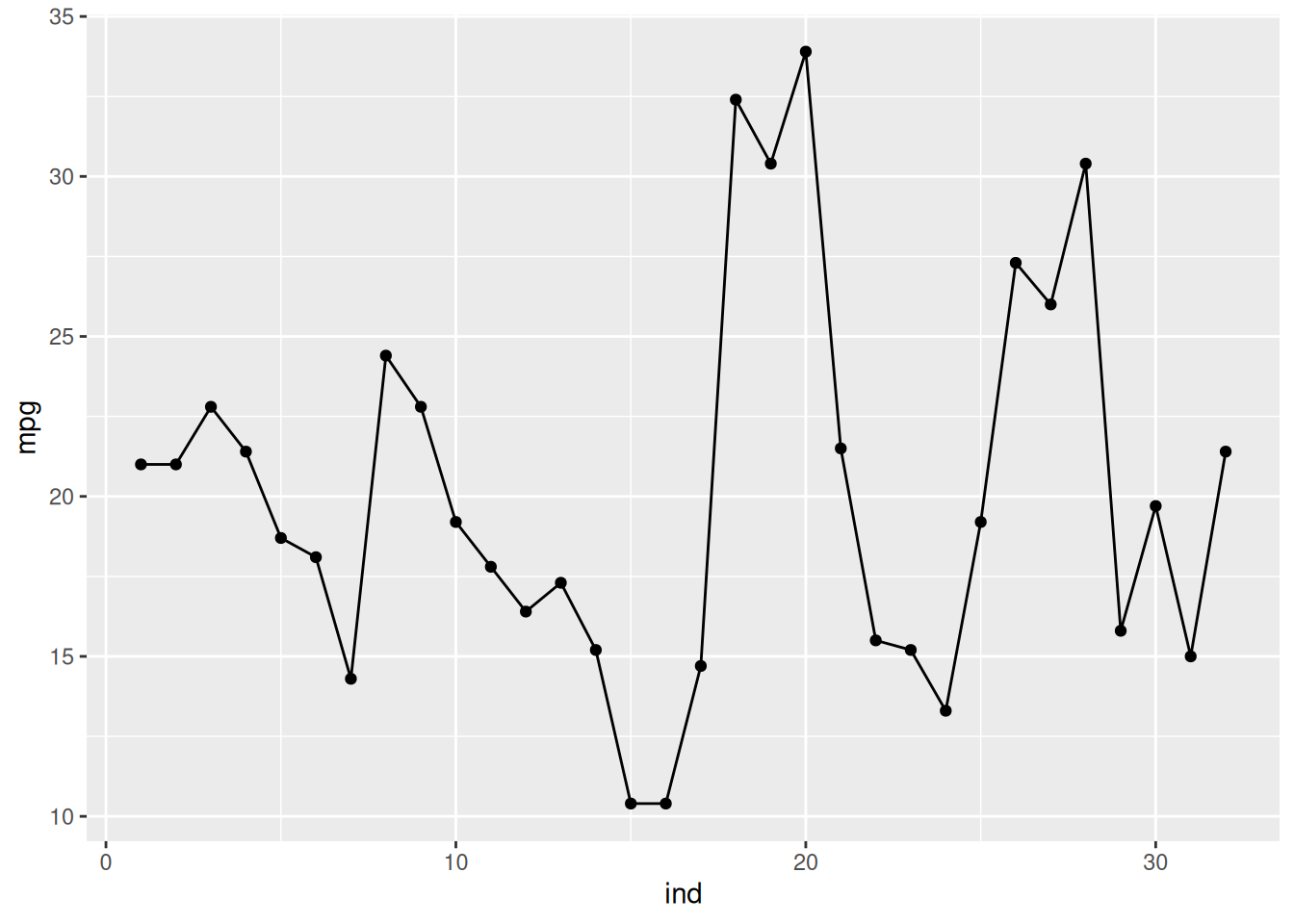
To create a 2 variable scatter plot. You will just need to specify the x and y arguments in the aes() function. Create a base plot using the mtcars data set and use the mpg and disp as the x and y variables, respectively, and assign in it to gg_2
gg_2 <- ggplot(mtcars, aes(mpg, disp))Now create a scatter plot using gg_2.
gg_2 + geom_point()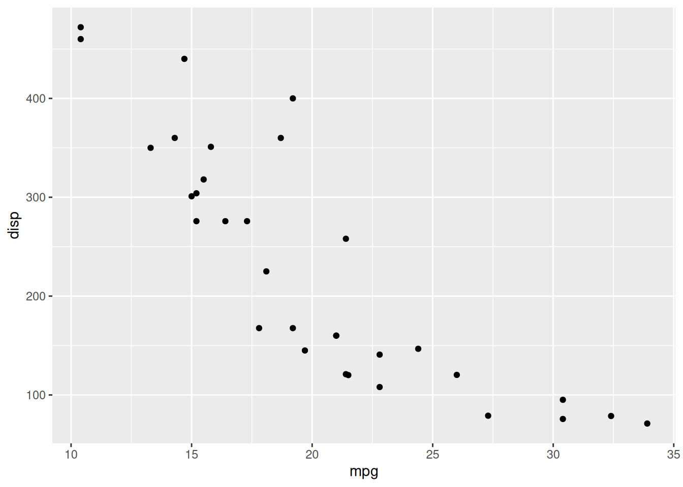
To create a histogram and density plots, create a base plot and specify the variable of interest in the aes() function, only specify one variable. Create a base plot using the mtcars data set and the mpg variable. Assign it to gg_3.
gg_3 <- ggplot(mtcars, aes(mpg))To create a histogram, use the geom_histogram() function.
gg_3 + geom_histogram()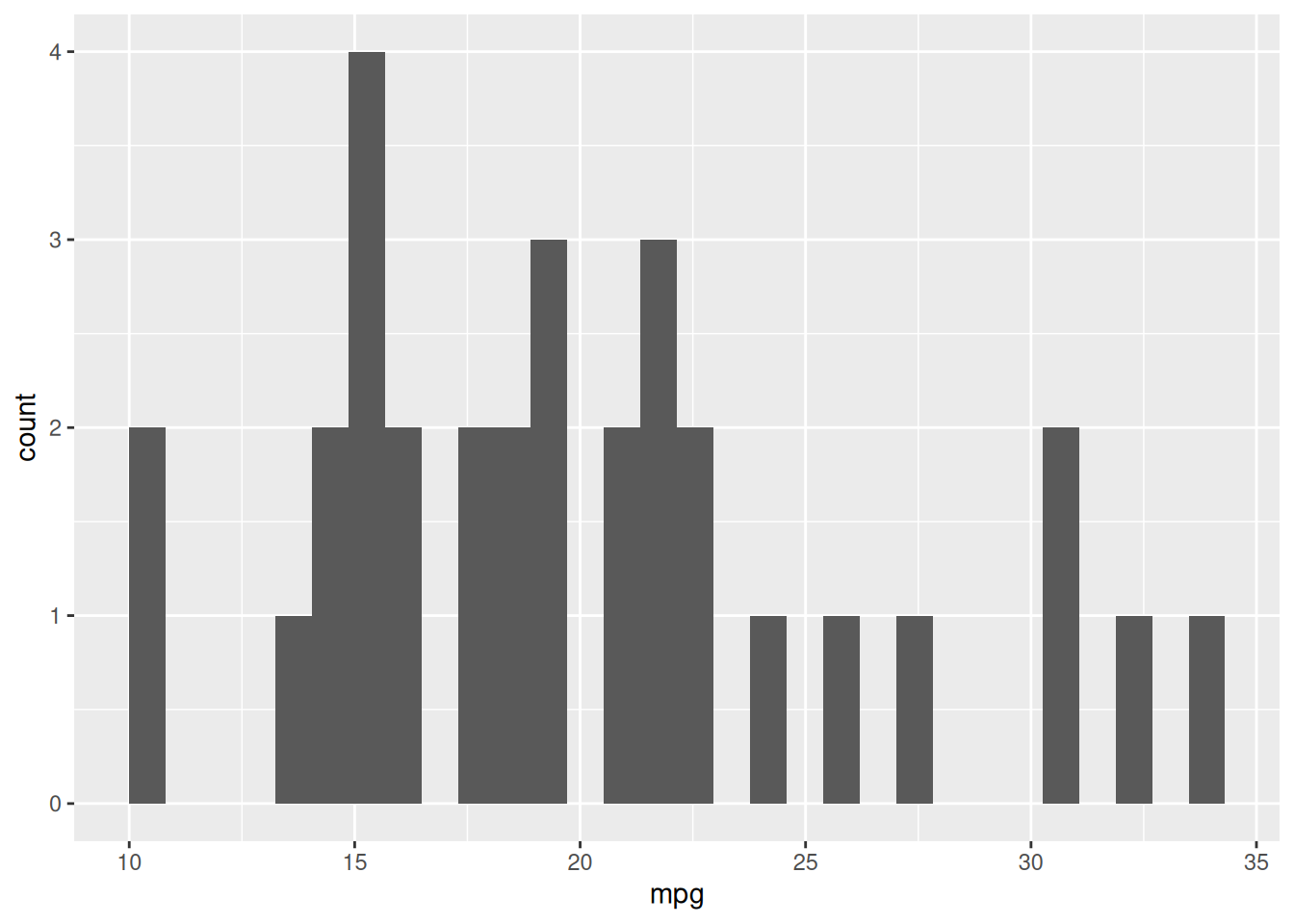
The above plot shows a histogram, but the number of bins is quite large. We can change the bin width argument, binwidth, the geom_histogram() function. Change the bin width to seven.
gg_3 + geom_histogram(binwidth = 7)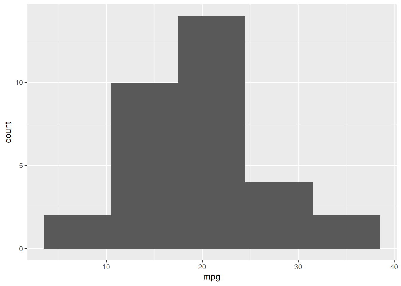
To create a density plot, use the geom_density() function. Create a density plot for the mpg variable.
gg_3 + geom_density()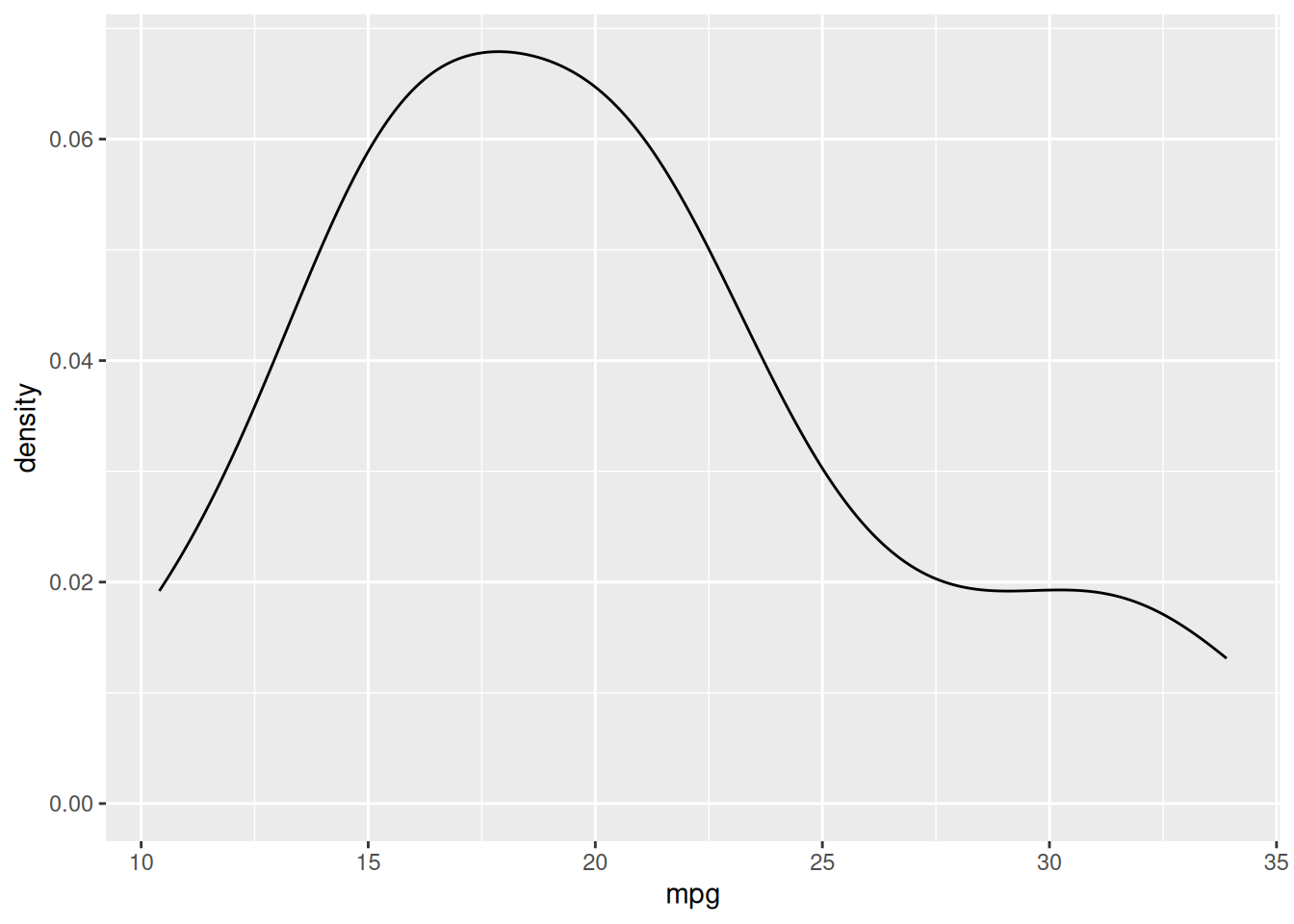
Similar to adding lines and points in the same plot, you can add a histogram and a density plot by adding both the geom_histogram() and geom_density() functions. However, in the geom_histogram() function, you must add aes(y=after_stat(density)) to create a frequency histogram. Create a plot with a histogram and a density plot.
gg_3 + geom_histogram(aes(y=after_stat(density)),bins=7) +
  geom_density()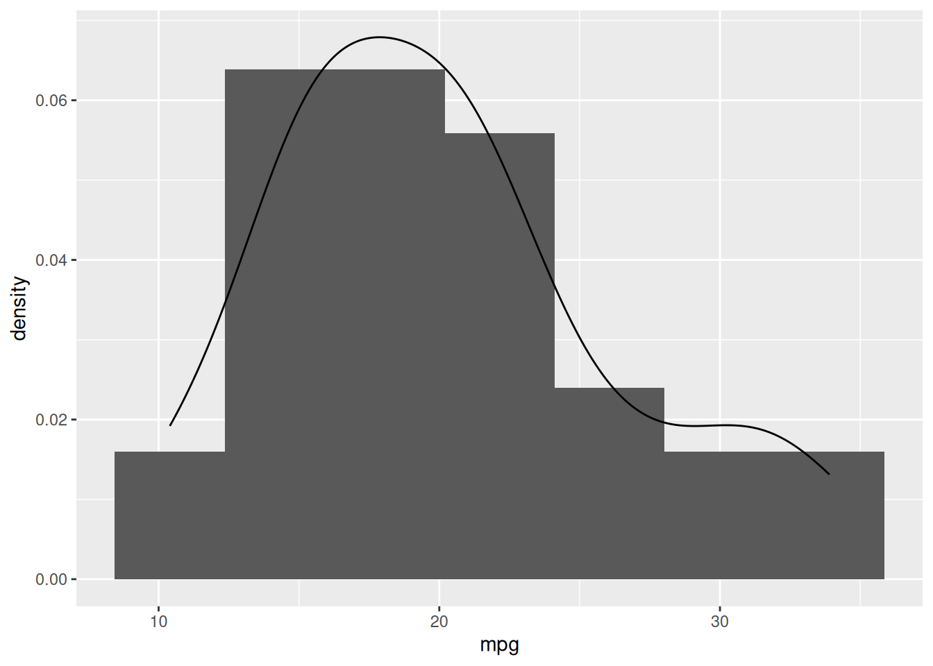
If you need to create a box plot, use the stat_boxplot() function. Create a boxplot for the variable mpg. All you need to do is add stat_boxplot() function.
gg_3 + stat_boxplot()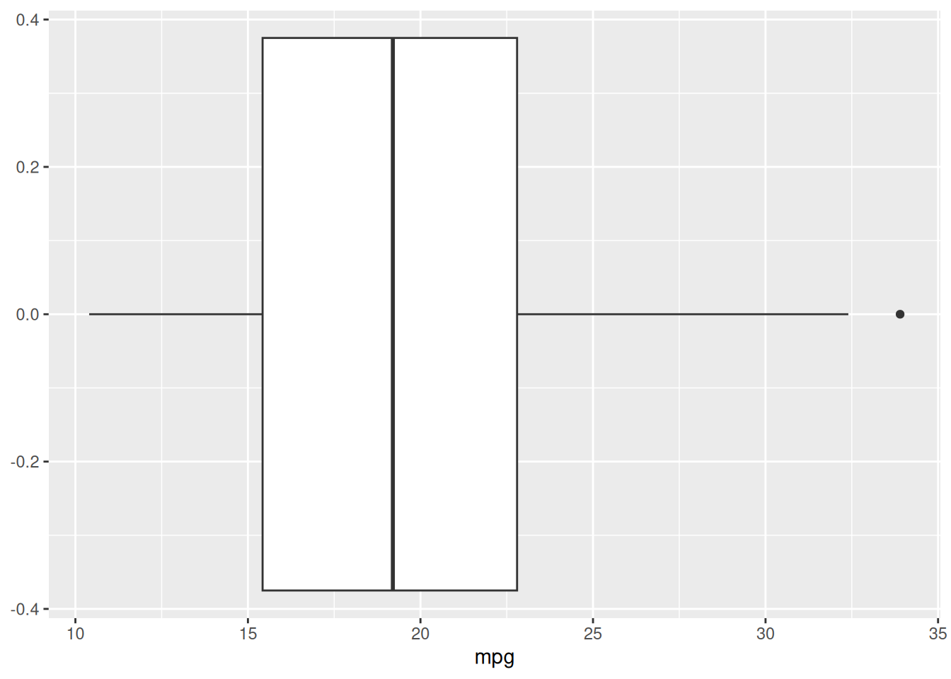
Creating a bar chart is similar to create a box plot. All you need to do is use the stat_count() or geom_bar() functions. First create a base plot using the mtcars data sets and the cyl variable for the mapping and assign it to gg_4.
gg_4 <- ggplot(mtcars, aes(cyl))Now create the bar plot by adding the stat_count() function.
gg_4 + stat_count()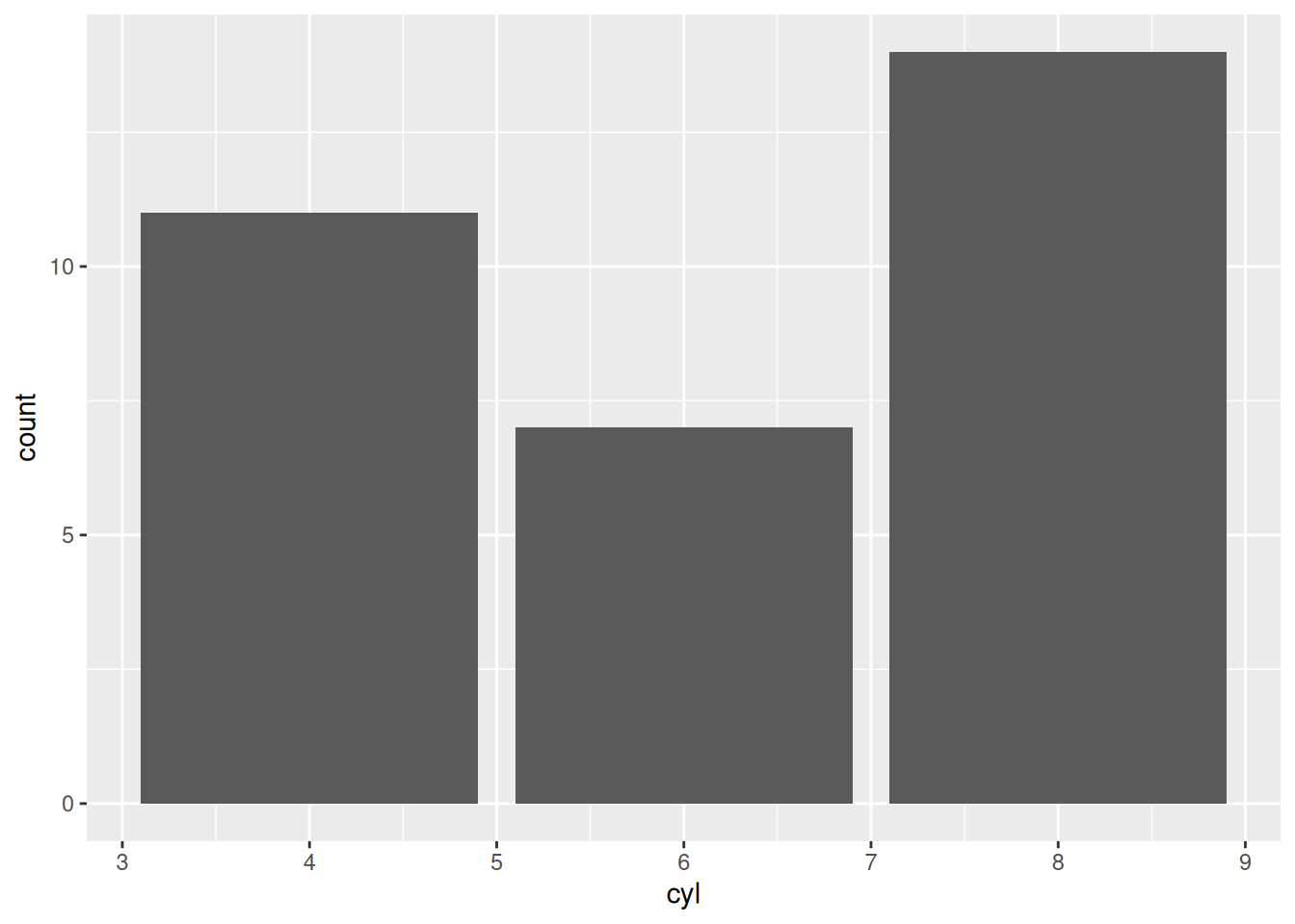
The ggplot2 package easily allows you to create plots from different groups. We will go over some of the arguments and functions to do this.
To begin, we want to specify the grouping variable within the aes() function with the color argument. Additionally, the argument works best with a factor variable, so use the factor() function to create a factor variable. Create a base plot from the mtcars data set using mpg and disp for the x and y axis, respectively, and set the color argument equal to factor(cyl). Assign it the R object gg_5.
gg_5 <- ggplot(mtcars, aes(mpg, disp, color=factor(cyl)))Once the base plot is created, ggplot2 will automatically group the data in the plots. Create the scatter plot from the base plot.
gg_5 + geom_point()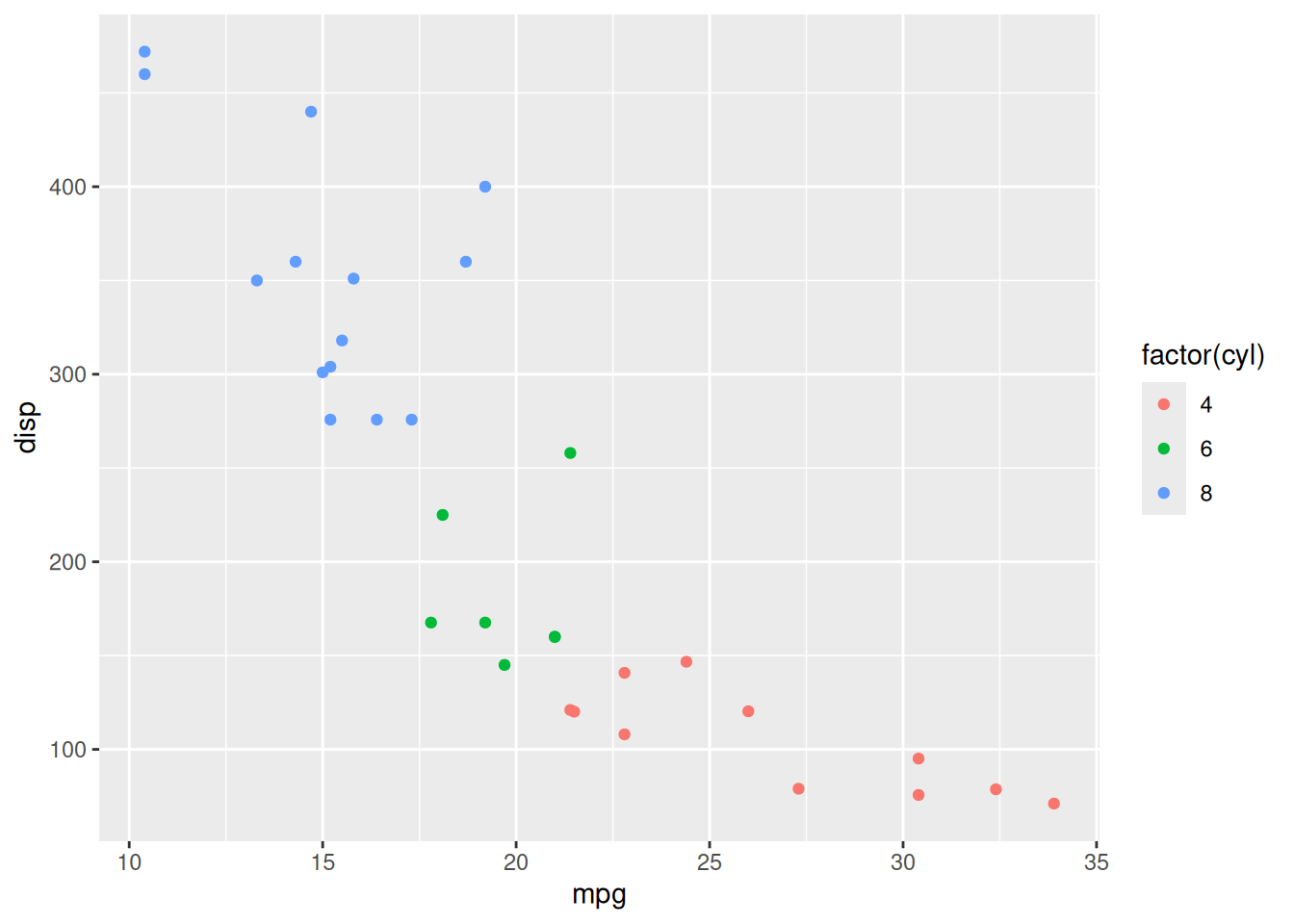
If you want to change the shapes instead of the color, use the shape argument. Create a base plot from the mtcars data set using mpg, and disp for the x and y axis, respectively, and group it by cyl with the shape argument. Assign it the R object gg_6.
gg_6 <- ggplot(mtcars, aes(mpg, disp, shape=factor(cyl)))
gg_6 + geom_point()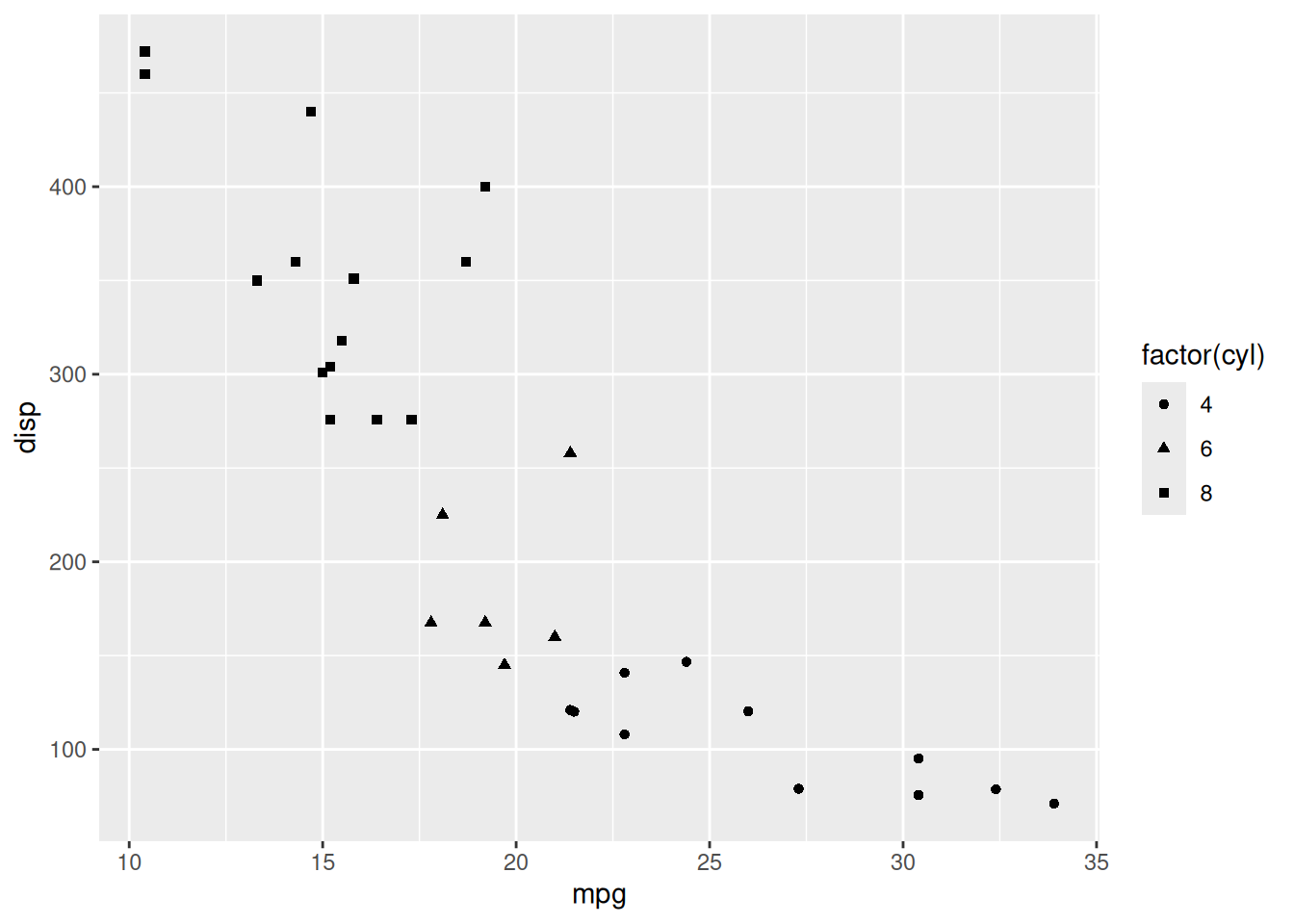
Histograms can be grouped by different colors. This is done by using the fill argument within the aes() function in the base plot. Assign it the R object gg_7.
gg_7 <- ggplot(mtcars, aes(mpg, fill = factor(cyl)))Now create a histogram from the base plot gg_7.
gg_7 + geom_histogram(bins = 6, alpha = 0.3)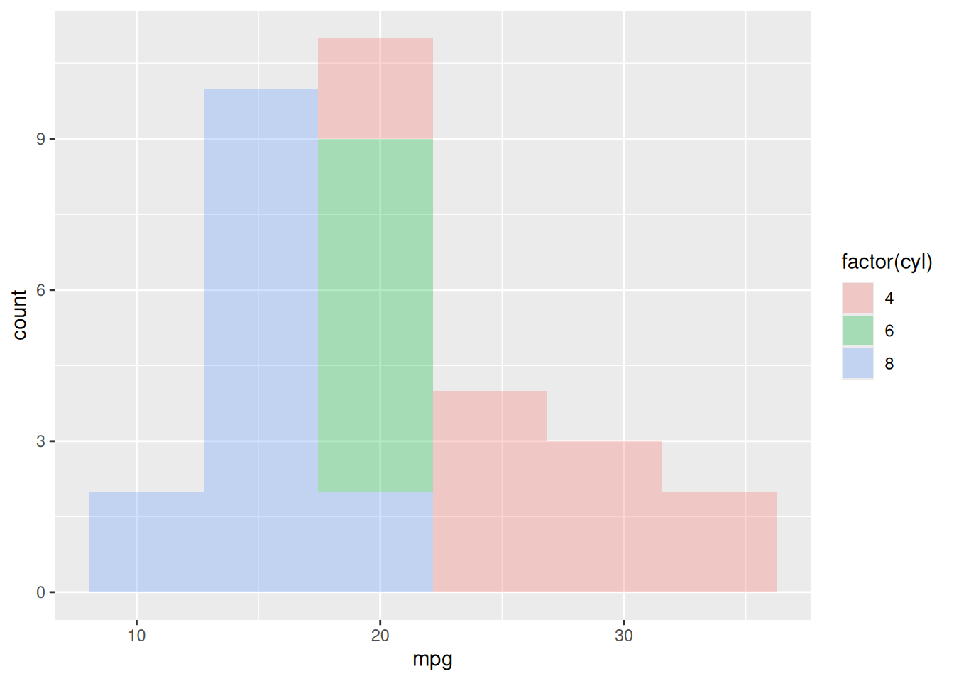
Sometimes we would like to view the histogram on separate plots. The facet_wrap() function and the flact_grid() function allows this. Using either function, you do not need to specify the grouping factor in the aes() function. You will add facet_wrap() function to the plot. It needs a formula argument with the grouping variable. Using the R object gg_3 create side by side plots using the cyl variable. Remember to add geom_histogram().
gg_3 + geom_histogram() + facet_wrap(~ cyl)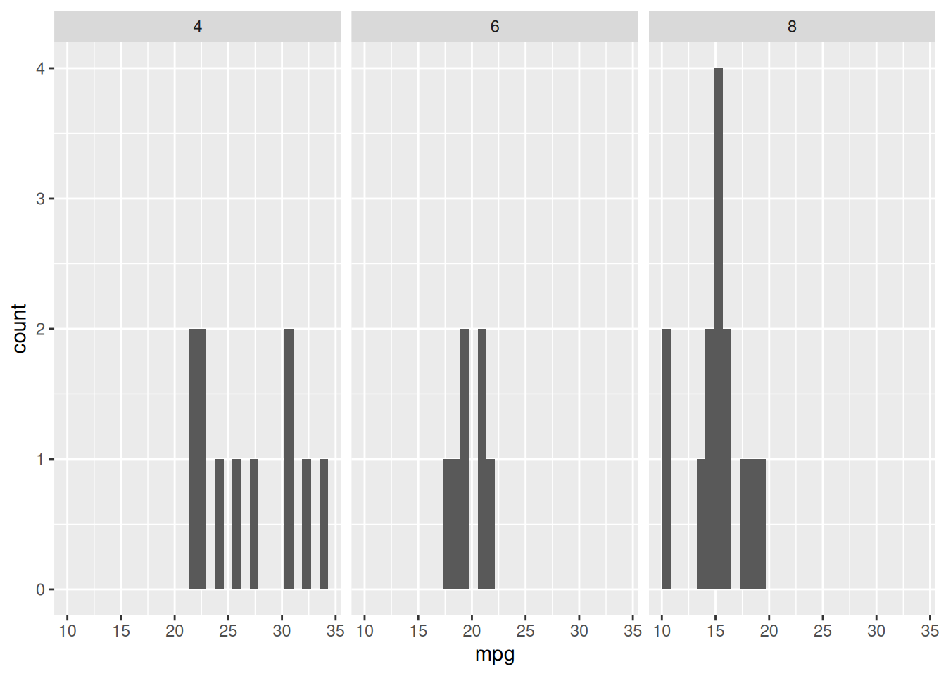
Similar to histograms, density plots can be grouped by variables the same way. Using gg_7, create color-coded density plots. All you need to do is add geom_density().
gg_7 + geom_density(alpha=0.3)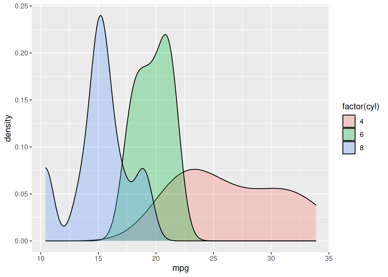
Using gg_3, create side by side density plots. You need to do is add geom_density() and facet_wrap() to group with the cyl variable.
gg_3 + geom_density() + facet_wrap( ~ cyl)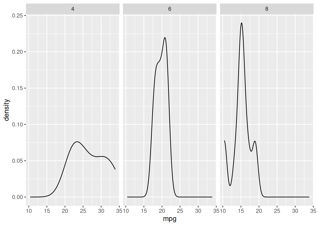
To create a side by side bar plot, you can use the facet_wrap() function with a grouping variable. Using gg_4, create a side by side bar plot using vs as the grouping variable. Remember to add stat_count() as well.
gg_4 + stat_count() + facet_wrap(~vs)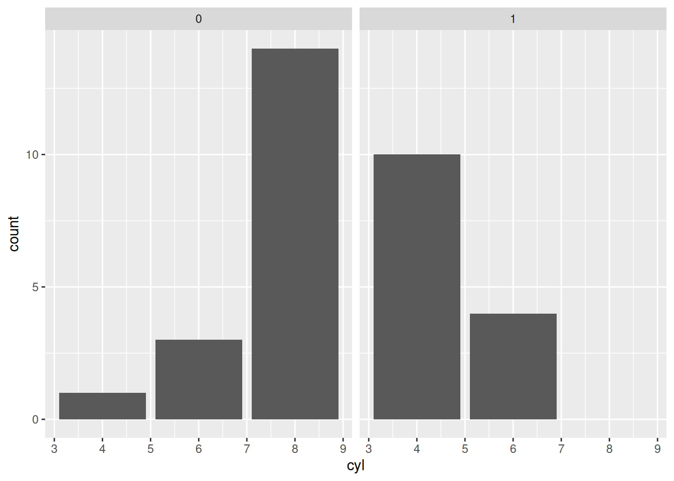
If you want to compare the bars from different group in one plot, you can use the fill argument from the aes() function. The fill argument just needs a factor variable (use factor()). First create a base plot using the data mtcars, variable cyl and grouping variable vs. Assign it to gg_8.
gg_8 <- ggplot(mtcars, aes(cyl, fill = factor(vs)))Now create a bar chart by adding stat_count().
gg_8 + stat_count()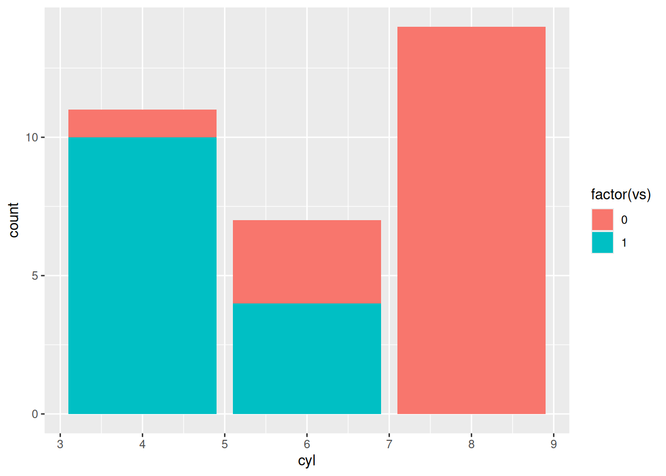
If you want to grouping bars to be side by side, use the position argument in the stat_count() function and set it equal to "dodge". Create the bar plot using the position = "dodge".
gg_8 + stat_count(position = "dodge")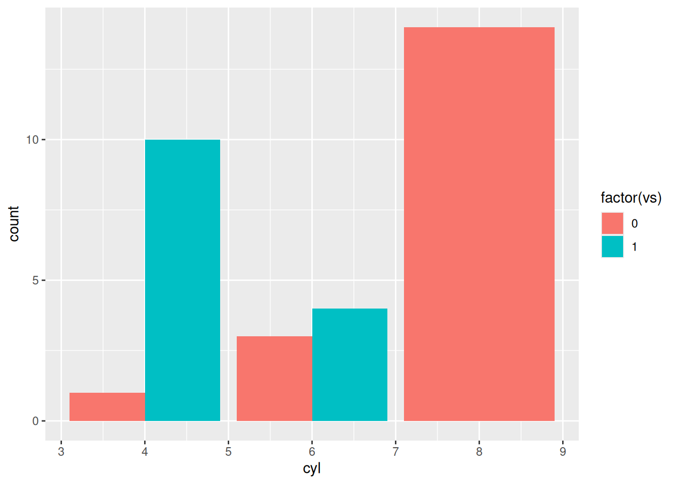
In this section, we will talk about the basic tweaks and themes to a ggplot2 plot. However. ggplot2 is much more powerful and can do much more. Before we begin, lets look at object gg_9 to understand the plot. To view a plot, use the plot() function.
plot(gg_9)
To change the title, add the ggtitle() function to the plot. Put the new title in quotes as the first argument. Change the title for gg_9.
gg_9 + ggtitle("Scatter Plot")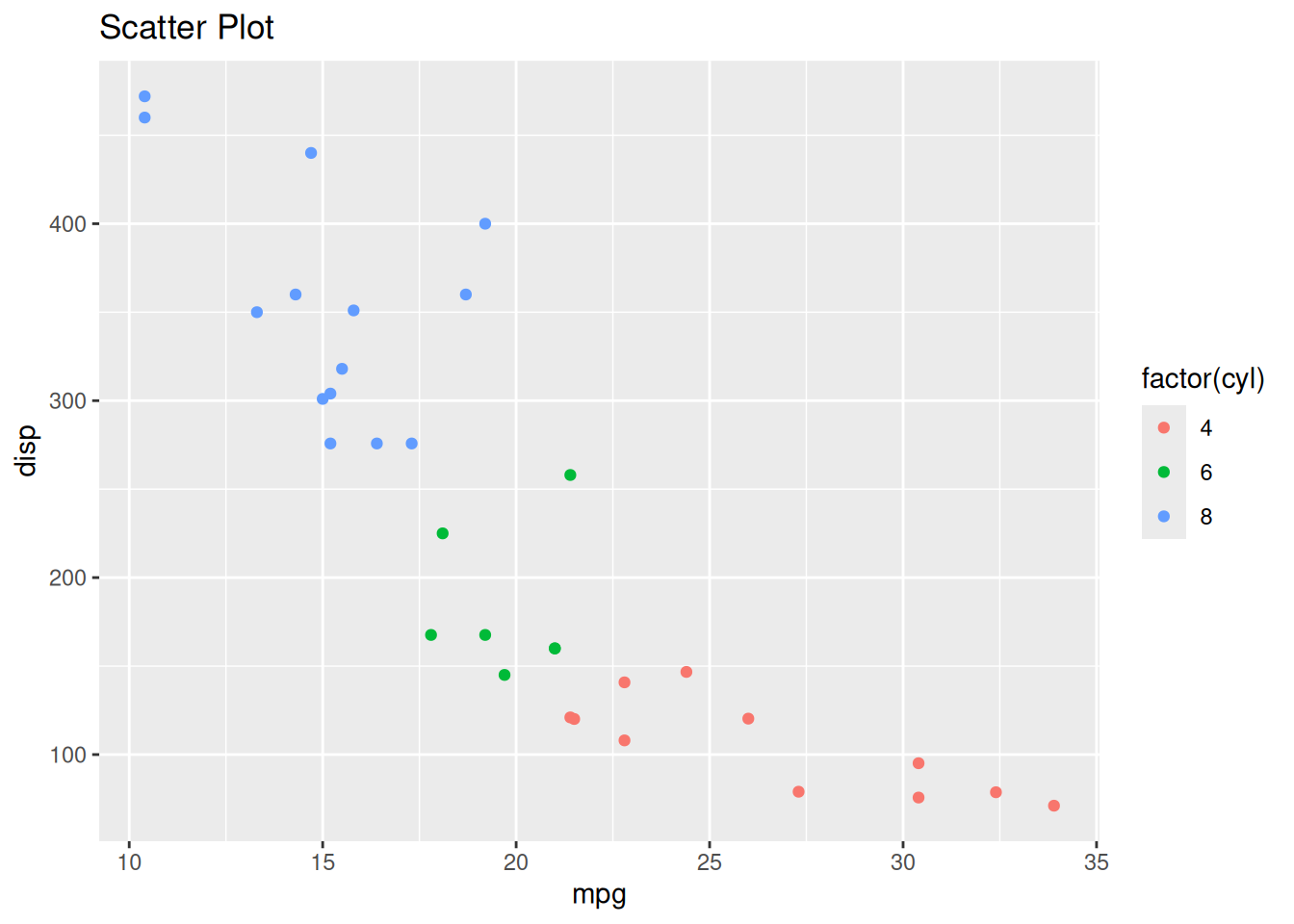
Changing the labels for a plot, add the xlab() and ylab() functions, respectively. The first argument contains the phrase for the axis. Change the axis labels for gg_9.
gg_9 + xlab("MPG") + ylab("Displacement")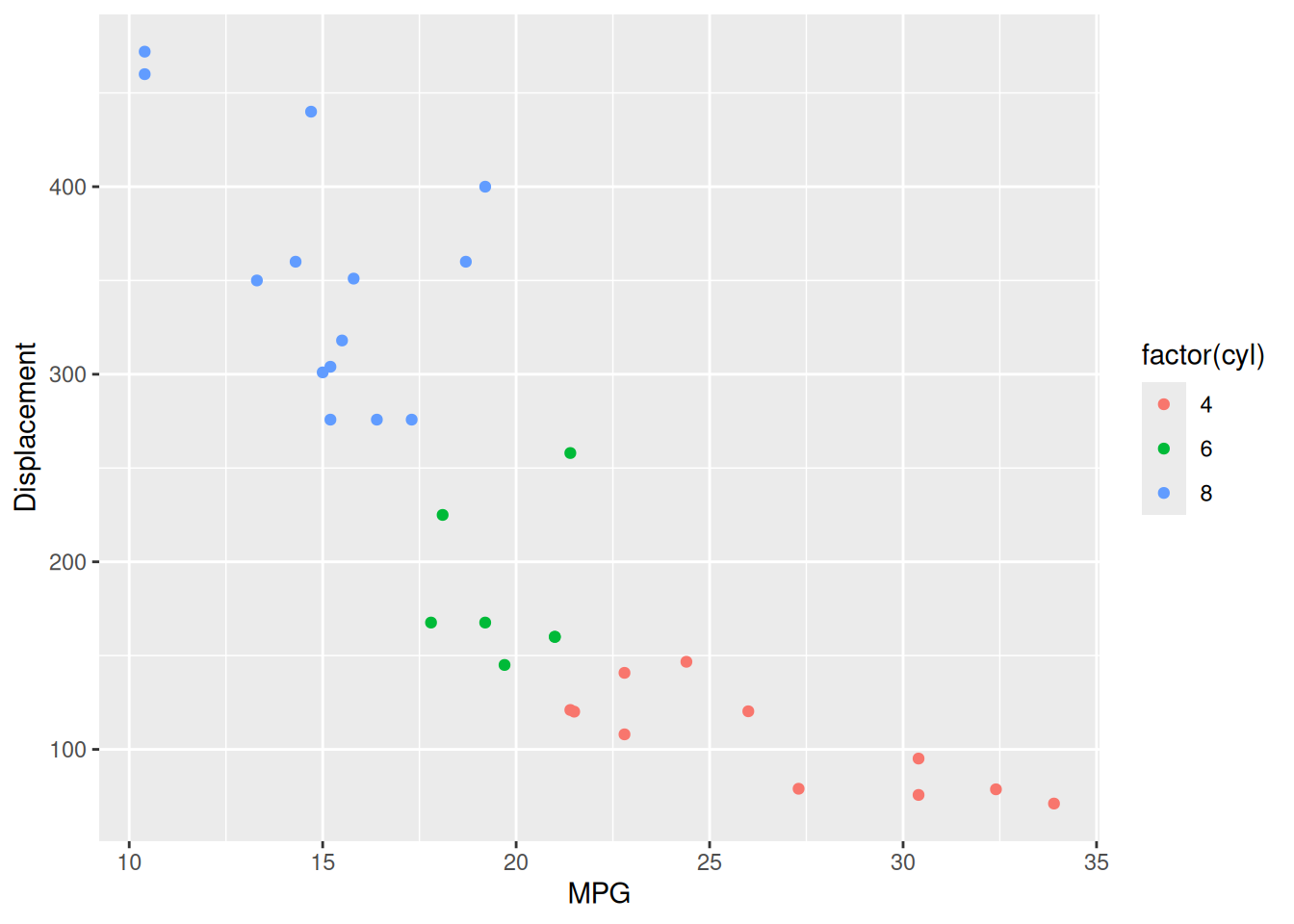
If you don’t like how the plot looks, ggplot2 has custom themes you can add to the plot to change it. These functions usually are formatted as theme_*() function, where the * indicates different possibilities. Change the theme of gg_9.
gg_9 + theme_bw()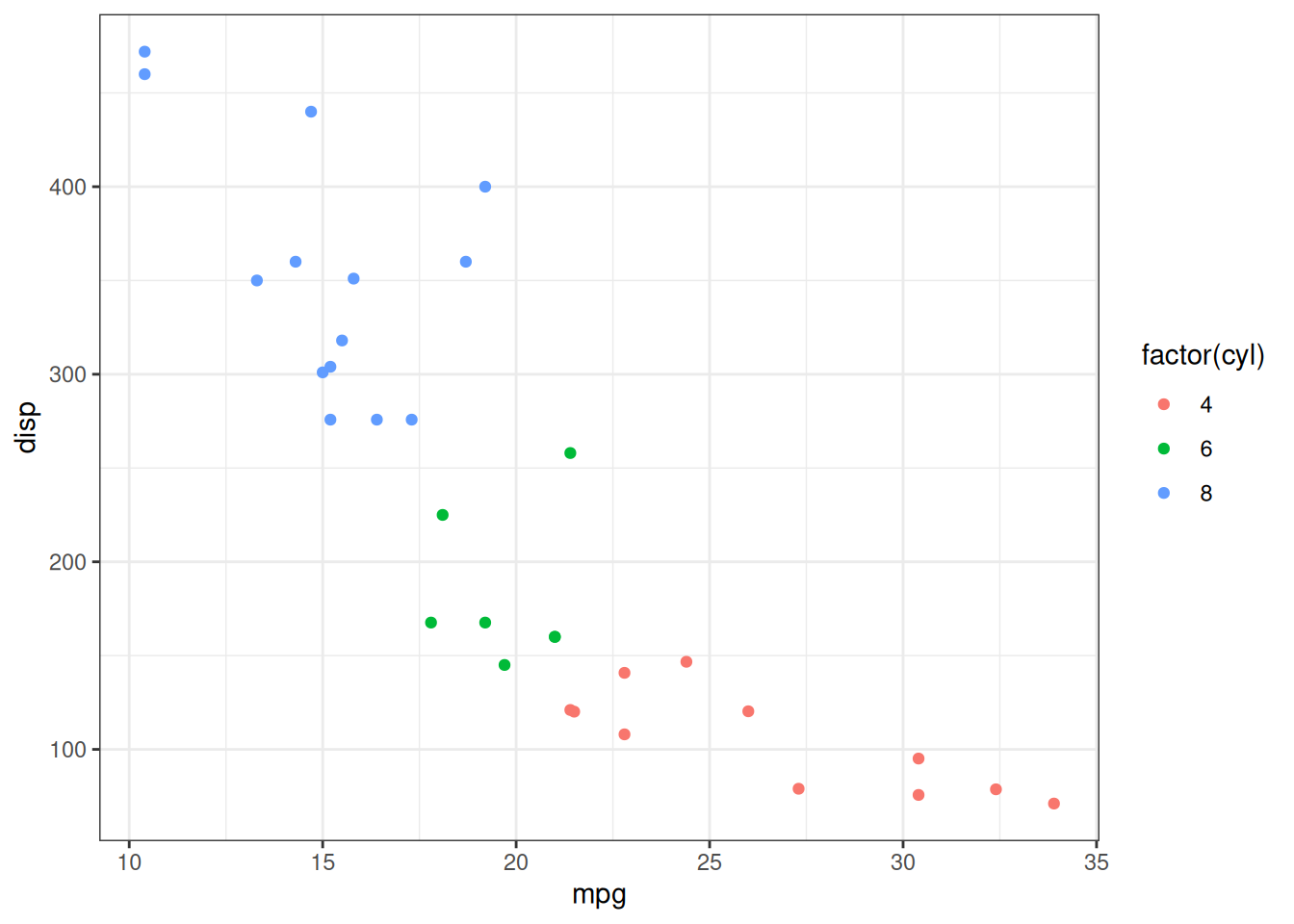
Additionally, you can change certain part of the theme using the theme() function. I encourage you to look at what are other possibilities.
If you want to save the plot, use the ggsave() function. Read the help documentation for the functions capabilities.